Contributions
Leadership Role
As UX Director, I had the responsibility of supporting a team that fluctuated between two and five UI/UX designers throughout the project, as we worked toward the goals and features outlined by our stakeholders and designers. My role extended beyond guiding my immediate team—it was also about championing the importance of UX and being a constant advocate for the user. I made it my duty to remind everyone involved who we were building this project for, continually reinforcing the “why” behind our decisions.
By consistently beating the drum for UX, I ensured that the user remained at the forefront of every discussion, pushing the team to deliver an experience that was not only functional but deeply intuitive and enjoyable.
User Experience
Eye-tracking, user testing, competitive analysis, stakeholder interviews, wireframing, interactive prototypes, analytics analysis, paper testing—you name it… we put this game’s experience through the ringer. In such a competitive landscape, it was my responsibility to ensure every part of the experience was as refined and intuitive as possible.
This approach also gave me the opportunity to promote UX principles throughout the team, fostering a culture where all designers had a vested interest or, at the very least, a fundamental understanding and expectation of the UX process.
User Interface and Layout
Given the team size, I was the sole creator of most out-of-game meta interfaces, handling everything from visual design to implementation within Unreal Engine. I collaborated closely with UI engineers to ensure the correct data and states were integrated, bringing our vision to life.
Additionally, I contributed extensively within the gameplay space, focusing primarily on core layouts and building skeleton widgets for engineers to fully wire together. This collaborative approach helped streamline the process and ensure a cohesive user experience across both gameplay and meta interfaces.
Visual Design
Striking the right balance between honoring a beloved franchise and pushing creative boundaries led us to a visual direction that felt both grounded in the Harry Potter universe and energized with a fresh, sports-driven flavor. While the core style was still developing when I joined, I played a key role in shaping and refining nearly all the screens in the final product.
A huge thanks to our illustrators and UI tech artists for supporting the creation of bespoke animations and visuals that elevated the experience..
Notable Features
Flowcharts
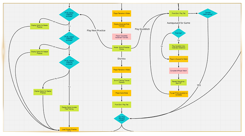
During the initial ideation of any feature, flowcharts were created to quickly map out the player journey. This not only helped inform stakeholders of the intended experience but also provided developers with a clear overview of the various features that needed consideration.
By investing time in this early-stage planning, we avoided the risk of “found work” cropping up during development. It also allowed teams to visualize and align their ideas at a high level, ultimately saving time and reducing frustration by ensuring that all necessary details were accounted for from the start.
Wireframing
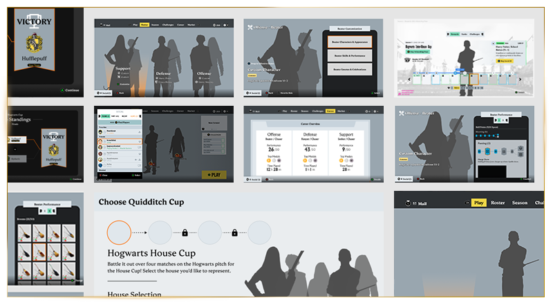
Working in tandem with the design documentation, interactive prototypes were developed in Figma to provide stakeholders with a tangible product for testing and iteration. This approach allowed for the identification of clear and efficient user journeys early in the process, ensuring that potential issues could be addressed before any code was written.
By involving stakeholders at this stage, feedback loops were shortened, and the design could be refined based on real user interactions, leading to a more polished and user-centered final product.
Playtesting
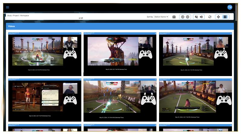
Internal playtests were conducted daily, while broader external playtests were scheduled during major milestones. These sessions, along with sentiment surveys, provided valuable insights into player feedback and communication. To capture deeper, unspoken interactions, we employed eye-tracking technology, allowing us to observe subtle behaviors and actions that players might not verbally articulate.
This combination of direct feedback and behavioral analysis ensured a comprehensive understanding of the player experience, enabling us to refine the game based on both player’s explicit and implicit interactions.
Analytics
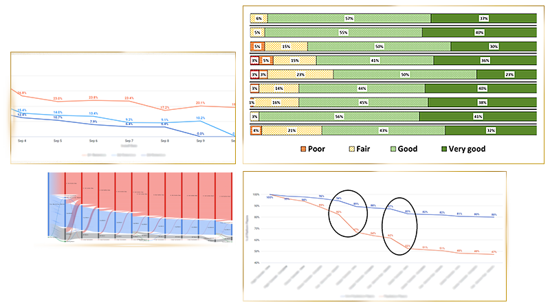
Tracking the player journey was crucial in building a sticky, engaging, and enjoyable experience. Analytic hooks were embedded at every stage of the “First Time User Experience” (FTUE) to monitor where players might begin to feel fatigued or want to engage with a new goal. Every screen, button, and interaction was tracked to identify these patterns, helping us understand which features players frequently revisited.
This data-driven approach allowed us to pinpoint what elements piqued their enjoyment, helping us craft increasingly fun and engaging activities for them to participate.
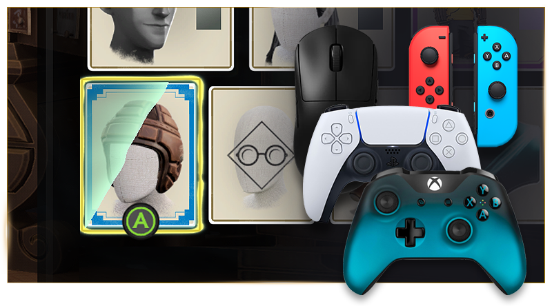
Cross-Platform
Quidditch Champions launched simultaneously on PlayStation 4/5, Xbox Series X/S/One, PC, and Steam Deck, with the Nintendo Switch release following shortly after. This was a significant effort, requiring strict adherence to each platform’s specific policies. Beyond performance optimization, a large portion of the work fell to the UI team, ensuring that all inputs were captured accurately, interaction paradigms met user expectations, platform-specific terminology was correctly reflected, and the game integrated seamlessly with the native OS of each console.
This attention to detail allowed for a smooth, consistent experience (with cross-play), across all platforms.
Accessibility
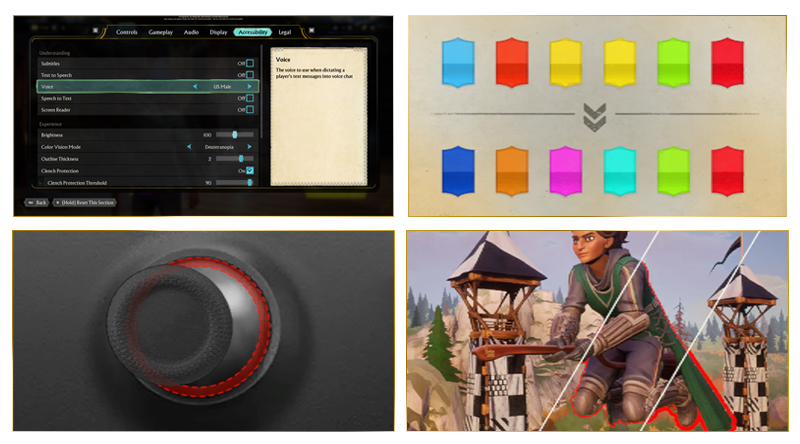
Given the global appeal of the Harry Potter brand, we recognized early on that accessibility was paramount from the moment players started the game. We ensured that all content was designed with adequate size and contrast, minimizing the need for users to adjust settings. Key gameplay elements were made fully adjustable to support various color vision deficiencies. Customizable subtitles, “clench protection” for players who require dexterity support, outline thickness to discern objects more clearly, audio feedback for all interaction, and screen reader technology was integrated throughout the experience to ensure inclusivity.
This commitment to accessibility allowed players of all abilities to fully enjoy the game right out of the box.
Global Support
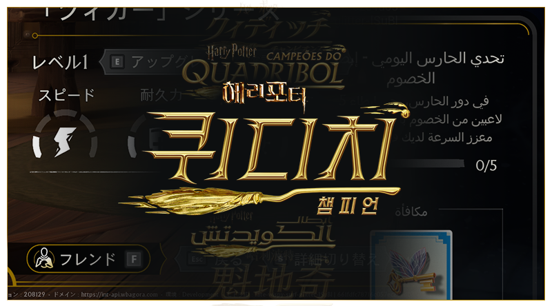
Quidditch Champions launched globally with support for over 10 languages, including French, German, Korean, and Arabic. Extensive development cycles were dedicated to ensuring that every aspect of the user interface was properly adapted for each language. Special attention was given to right-to-left languages like Arabic, with custom systems implemented to ensure a seamless and enjoyable experience for players.
This level of care and localization helped deliver a cohesive, accessible gameplay experience for diverse audiences around the world.